
Brand Identity
BRAND PROMISE
What is our next stop? Because the truth is that life’s a trip.
And Downtown Urbandale is a gateway. Not just from one side of the city to the other. It’s a portal that connects our past to our future. It links us to each other:
- East and west
- Old and young
- Sentimental and forward-thinking
Downtown Urbandale is an introduction to everything else the city has in store. Together, we see a vibrant destination soon filled with shops, housing, and most importantly, people.
Where we circle back to what matters. We don’t need to grasp for something from scratch. Instead, we’re rediscovering who we are, mining for meaning from what came before.
Because there are memories here.
And hopes.
And aspirations.
And a vision for what’s ahead.
That’s what makes this neighborhood another example of what it means to be “uniquely Urbandale.” This is where it began and where something new now begins. Defined by the people who made it what it was and will make it so much more. Designed to linger, staying around to make new memories in real time. Where we go from here will be driven by everyone in our community.
So, let’s get ready to create moments. Meet us at a location with history. Experience what happens when what’s old is new again.
In the near future, when you’re looking for a night out with friends. Or a space to shop local. Or a place to call home. You’re headed to Downtown Urbandale.

USING THIS GUIDE
A strong brand is built through consistency. Every time the Downtown Urbandale brand appears, it should look, feel and communicate like the same place, no matter where you see it.
This guide provides the tools and standards to help keep the brand recognizable and true to its original form. Using the official logo artwork, colors, typography and visual elements as intended protects the integrity of the brand and makes it easier for people to recognize Downtown Urbandale wherever they encounter it.
Think of this guide as your go-to resource. Before creating something with the Downtown Urbandale brand, start here. Use the original files, follow the guidelines and resist the urge to alter, stretch, recolor or recreate the elements.
Consistency doesn’t mean everything has to look the same. It means every expression of the brand feels like it belongs to the same Downtown.
ON THE COLOR & DESIGN
Deep blue anchors Urbandale’s history, while bright blue, orange, and magenta inject a modern, welcoming energy. The bold intersections of these colors visualize community connection, bridging the gap between then and now.
The “DU” logomark uses dimensional layering to represent a community building its future right upon a rich history. By overlapping bold shapes and colors, we’ve created an entirely new layer of experience, capturing that exact moment where Urbandale’s past meets its next chapter.
HORIZONTAL

SURROUNDING SPACE
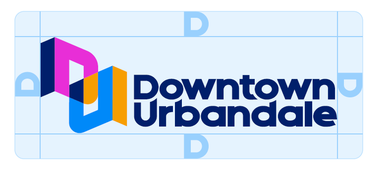
A minimum area surrounding the logo must be kept clear of any other company names, symbols, and/or logos. More than the minimum clear space is encouraged if the application provides the opportunity.
When viewed electronically (i.e. website, electronic newsletters), logos must be separated from any other company names, symbols, and/or logos by a minimum of 40 pixels or 1 “D” height, whichever is greater.
CORRECT USAGE
Logos must not be altered in any way other than to adjust the size proportionally. It is never acceptable to change the color of the logo, but the logo may be overprinted on light shades of color or lightly colored and textured backgrounds that do not make it illegible.

SPECIFICATIONS
Downtown Urbandale has standards for reproducing colors so they always look consistent, no matter where they appear. For example, the logo should be reproduced in full color whenever possible.
These colors should be incorporated throughout Downtown Urbandale communications and are equivalent to the Pantone Matching System numbers listed in the table below. For four-color process printing (also known as full-color printing), refer to the CMYK values shown. For desktop publishing, such as Microsoft® Word or Microsoft PowerPoint, refer to the RGB (print/on-screen) values. For web applications, refer to the RGB (print/on-screen) values or Hexadecimal web values.
The Pantone and CMYK values provided can be used on both coated and uncoated paper when printing. Although variations in color will occur, try to match the colors as closely as possible. For applications in color systems not included here, use the Pantone values for color matching.
PRIMARY
OG Blue
SpotPMS 2756
CMYK100 / 93 / 32 / 31
RGB0 / 32 / 92
HEX#00205C
Bright Blue
SpotPMS 3005
CMYK75 / 40 / 0 / 0
RGB0 / 136 / 248
HEX#0088F8
Magenta
SpotPMS 807
CMYK30 / 90 / 0 / 0
RGB232 / 45 / 214
HEX#E82DD6
Tangerine
SpotPMS 1375
CMYK0 / 40 / 100 / 0
RGB247 / 158 / 0
HEX#F79E00
SECONDARY
Lime
SpotPMS 375
CMYK42 / 0 / 98 / 0
RGB162 / 209 / 58
HEX#A2D13A
UN Blue
SpotPMS 283
CMYK36 / 7 / 0 / 0
RGB153 / 208 / 252
HEX#99D0FC
Sand
SpotPMS 7506
CMYK2 / 4 / 18 / 0
RGB249 / 238 / 210
HEX#F9EED2
Charcoal
SpotPMS 426
CMYK0 / 0 / 0 / 90
RGB64 / 64 / 65
HEX#404041
Headlines:
Figtree Medium, 50 pt
Lorem Ipsum Dolor
Sub-Headlines:
Zalando Sans
Expanded Black, 14 pt
Expanded Black, 14 pt
PROIN DIAM EST, TEMPUS SIT AMET VARIUS
Body Copy:
Figtree Regular, 11pt,
Line Height set to 14pt
Line Height set to 14pt
Lorem ipsum dolor sit amet, consectetur adipiscing elit. Proin diam est, tempus sit amet varius ut, tempus ut mauris. Morbi fringilla magna a varius feugiat. Cras efficitur lectus sed posuere imperdiet. Orci varius natoque penatibus et magnis dis parturient montes, nascetur ridiculus mus. Pellentesque feugiat ex et diam aliquam condimentum. Sed efficitur tincidunt neque turpis cursus nulla. In vulputate velit mattis, rhoncus sem in, pharetra urna. Fusce volutpat est sit amet nibh congue, vel accumsan nunc pharetra. Duis quis dui id libero euismod euismod. Nulla sed eleifend nunc. Proin hendrerit eleifend quam sit amet lacinia.
Call-out Text/Quotes:
Figtree SemiBold Italic, 13pt,
Line Height set to 17pt
Line Height set to 17pt
Nulla sed urna turpis. Aenean molestie porttitor scelerisque. Nunc posuere tempus erat in ultrices. Ut at velit. Quisque nec tellus non ex imperdiet tristique.
The Downtown Urbandale brand, including all associated logos, artwork, designs, trademarks, and visual assets, is owned by the City of Urbandale. All rights reserved. Use of these materials is subject to the City of Urbandale’s brand guidelines and applicable permissions.